





Brand identity
Oxygen is the quietest form of vitality.
Every breath is life.
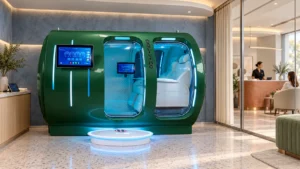
We design and manufacture next-generation oxygen wellness capsules — precision engineering wrapped in calm. This is how our brand looks, sounds and behaves.
01 — Brand
Why we exist. Mission, vision, values.
Mission
To bring precision-engineered oxygen capsules within reach of everyday life.
Vision
To make oxygen a calm, trusted ritual of living well.
02 — Logo & mark
The master lockup.
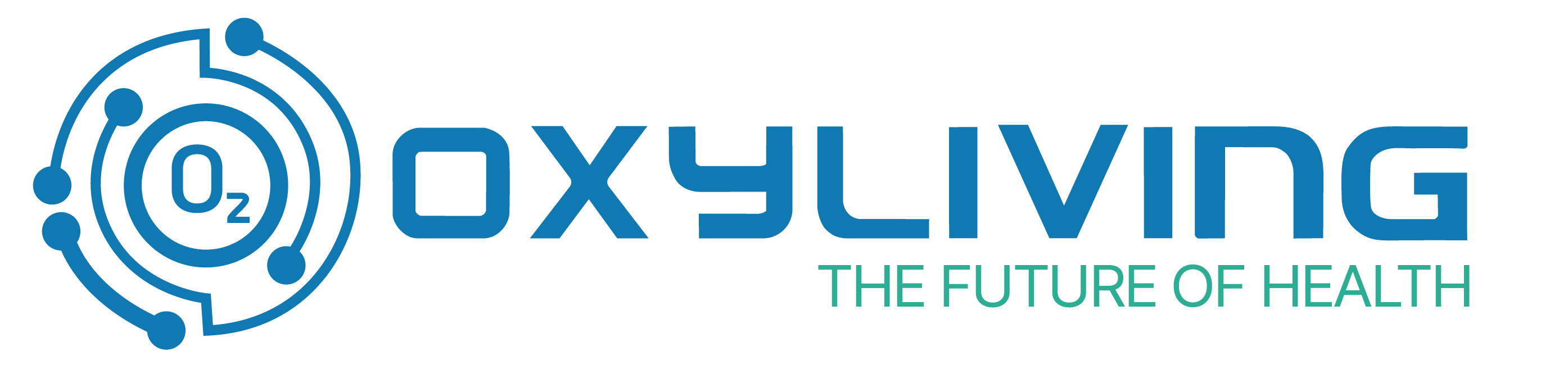
The mark, the wordmark and the tagline are drawn as one artwork. Use the master lockup wherever space allows; never rebuild, re-space or re-typeset it.


Clear space
Room to breathe.
Clear space on all sides equals the height of the O₂ mark (x). Keep every other element — type, images, edges — outside this zone.
Misuse
Please don't do this.
03 — Colour
Solid blue, calm teal.
Usage ratio — blue 70% · teal 18% · neutral 8% · amber 4%
950
800
600
400
200
100
White
04 — Typography
Three families, clear roles.
Aa
Space Grotesk
Headings
Light · Medium · Semibold
Aa
Inter
Body
Light · Regular · Semibold
Aa
Jost
Technical labels
Light · Regular · Semibold
07 — Downloads
Take the brand with you.
Press, partners and distributors: everything you need to represent Oxyliving correctly.